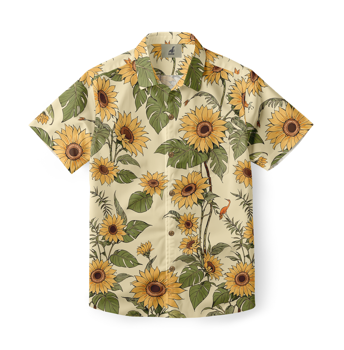
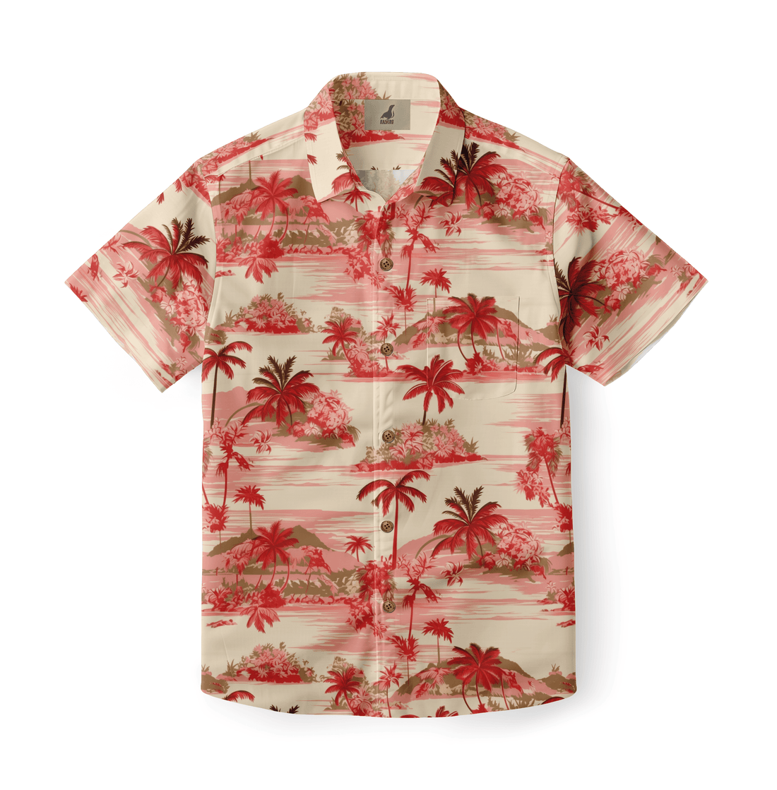
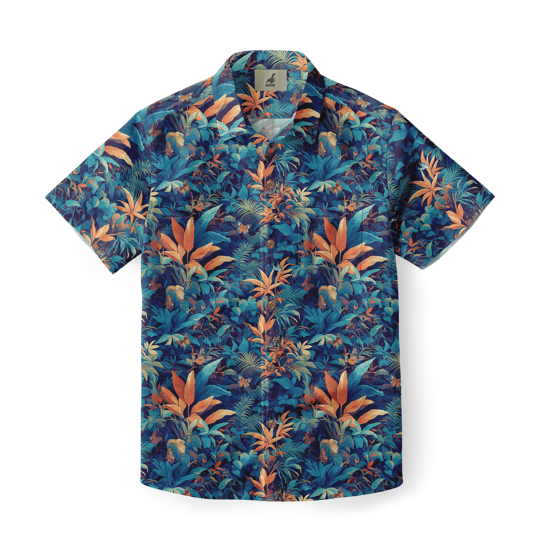
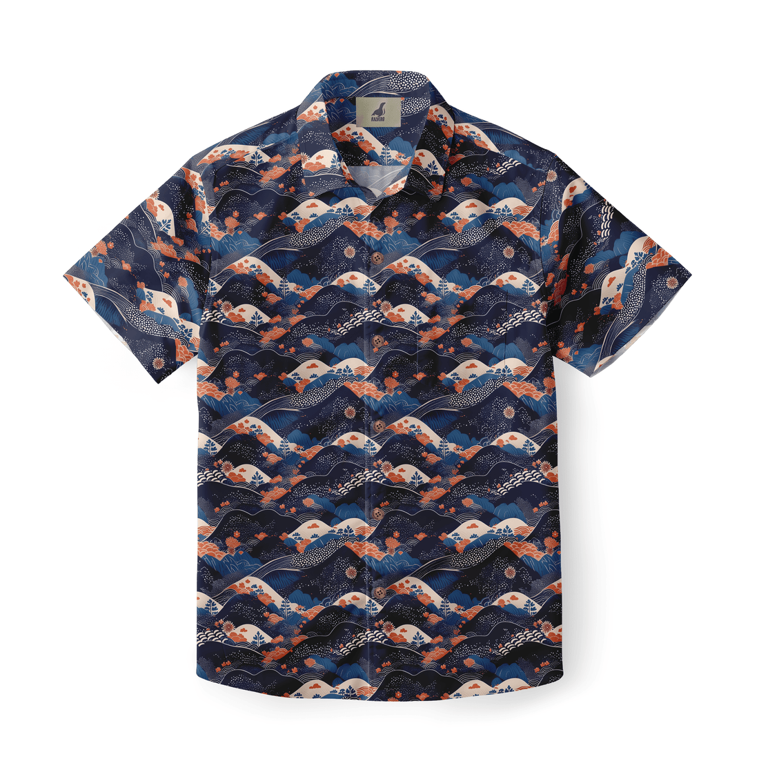
The Psychology of Colors in Hawaiian Shirts. This phrase frames how color choices shape mood, identity, and buying behavior in aloha apparel. Designers and brands rely on color psychology to match patterns with context and audience. Bright florals create festive associations, while muted tones signal refined tastes. Consumers often select a shirt based on emotional cues rather than technical specs. Understanding these cues helps merchandisers present assortments that convert views into purchases. Retailers also balance seasonality, cultural symbolism, and trend tempo when choosing color mixes. Visual merchandising benefits from pairing complementary pieces to emphasize palette intent. Thoughtful color planning turns casual shirts into powerful brand statements.
The Psychology of Colors in Hawaiian Shirts: Core Concepts
The Psychology of Colors in Hawaiian Shirts connects basic color theory to fabric behavior and consumer reaction. Hue, saturation, and brightness influence perceived warmth and approachability. High saturation generally reads as youthful and loud, while lower chroma feels subdued. Color combinations change perceived price and craftsmanship at a glance. Visual attention follows contrast edges, guiding the eye across pattern focal points. Emotional associations tie to cultural memories and personal histories. Marketers observe that context matters, such as beachwear versus city styling. Practical testing, via focus groups or A/B imagery, validates palette choices before large production runs. Brands that apply core concepts consistently report better category performance.
The Psychology of Colors in Hawaiian Shirts: Historical Context and Cultural Roots
The Psychology of Colors in Hawaiian Shirts traces back to island culture and Western trade influences. Early aloha shirts combined native motifs with imported dyes and textile techniques. Trade routes introduced new pigments and production methods, expanding the available palette. Local symbolism assigned meanings to floral and botanical colors over generations. Western tourism then amplified the shirts’ role as cultural souvenirs and status signals. Marketing in mid-century America turned bright prints into icons of leisure and prosperity. Contemporary designers draw from that layered history while adapting palettes for global markets. Respect for origin and provenance strengthens authenticity and consumer trust when brands highlight cultural roots.
Materials, Print Techniques, and Their Effect on Color Perception
Material choice shapes how colors read and age on aloha shirts. Cotton absorbs dyes differently than rayon or viscose, altering brightness and softening edges. Digital printing delivers high color fidelity and crisp motifs, while screen printing yields tactile, layered impressions. Reactive dyes bond strongly to cellulose fibers, producing durable hues that resist fading. Pigment printing layers color on the surface, which can shift with wear. Fabric finish and weave also modulate sheen, which affects color temperature under varied light. When planning catalogs, brands should test samples under retail lighting and sunlight. Proper testing prevents surprises in final production and preserves intended color narrative across stock.
Warm Palette Effects: Red, Orange, Yellow, and Energy Signals
Warm palettes drive immediate emotional reactions and attention in retail displays. Red conveys urgency, passion, and celebration when applied to bold botanical motifs. Orange blends warmth with playfulness, often appealing to youthful buyers seeking vibrancy. Yellow signals sunshine and optimism, though excessive yellow may cause visual fatigue in dense patterns. Designers leverage warm tones to create focal points and seasonal capsules for holidays. When combined with cooler accents, warm colors pop without overwhelming composition. Balancing warm tones with neutral grounding elements preserves wearability across demographics. Retail photos that emphasize warmth tend to raise click-through rates for resort and vacation collections.
Cool Palette Effects: Blue, Green, Purple, and Calm Signaling
Cool colors tend to support relaxation and trust in apparel narratives. Blue evokes oceanic references and reliable vibes that suit resort wear. Green carries botanical authenticity and suggests environmental sensibilities for eco-minded consumers. Purple often reads as premium or artisanal when paired with deep contrasts. Teal and aqua shades bridge warm and cool domains for versatile styling. Patterns dominated by cool hues usually perform well in daytime and evening resort settings. Merchandisers leverage cool palettes for collections aimed at mature buyers or wellness-focused markets. Subtle gradients and low-saturation variants maintain sophistication without losing island character.
Contrast, Saturation, and Pattern Density in Aloha Shirts
Contrast and pattern density govern legibility and perceived value in Hawaiian shirts. High-contrast motifs accelerate visual impact at a distance, aiding discovery on crowded racks. Lower contrast with richer textures invites close inspection, which can suggest craftsmanship and price. Saturation levels determine whether a print reads as vintage, modern, or retro. Designers must also consider repeat scale and motif overlap, since dense repeats can appear chaotic on smaller sizes. Visual hierarchy guided by contrast helps the eye find collars and hems first. Testing images on mobile ensures patterns translate across shopping platforms, improving conversion rates and customer satisfaction.
Audience Segmentation: Age, Occasion, and Cultural Meaning
Audience segmentation refines color choices for different buyer cohorts. Younger shoppers often prefer bold palettes and experimental contrasts. Older buyers may opt for tonal depth and classic motifs that signal refinement. Occasion matters, from casual backyard events to upscale resort dinners where subtle colors may excel. Cultural meaning shifts by market; a hue that reads festive in one country may carry different connotations elsewhere. Brands operating globally should create market-specific colorways rather than a single universal palette. Retail analytics, combined with customer feedback, refines segmentation over time and improves assortment planning for diverse channels.
List of Color Strategies for Hawaiian Shirt Design
-
Anchor each print with a grounding neutral tone
-
Use one dominant hue and two supporting accents
-
Test saturation across natural and artificial lighting
-
Scale motifs so patterns remain readable on small sizes
-
Introduce limited-edition palettes to drive urgency
List of Color Strategies for Hawaiian Shirt Design
List of Color Strategies for Hawaiian Shirt Design provides practical steps designers can follow when creating new collections. Anchoring prints with neutral tones reduces visual fatigue and improves outfit integration. Choosing a dominant hue helps store teams categorize SKUs effectively. Lighting tests prevent unexpected shifts in perceived color across channels. Correct motif scaling ensures consistent fit and visual harmony across sizes. Limited drops of exclusive palettes increase shopper urgency without overwhelming baseline assortments. Bringing these strategies into the design brief helps cross-functional teams deliver predictable visual outcomes and stronger retail performance.
Comparative Color Traits Table
| Color Family | Primary Impression | Best Use Case |
| Warm (Red/Orange) | Energetic, festive | Holiday and party wear |
| Cool (Blue/Green) | Calm, trustworthy | Resort and casual settings |
| Muted Earth | Vintage, artisanal | Premium or craft collections |
| High Contrast | Attention-grabbing | Window displays and hero pieces |
Comparative Color Traits Table
Comparative Color Traits Table clarifies trade-offs when selecting palettes for different retail roles. Warm families excel as hero pieces and impulse buys, while cool families support repeat purchases and comfort-driven segments. Muted earth tones help position collections at higher price points, influencing perceived craftsmanship. High-contrast prints increase visibility in crowded markets but can lower perceived subtlety. Using the table during assortment planning streamlines decisions about which SKUs to push in ads versus in-store feature displays. Teams that align product positioning with the table achieve consistent messaging and fewer markdowns.
How Brands Use Color Psychology in Product Pages and Packaging
Brands employ color psychology on product pages to guide shopper expectations and conversions. Hero images use contrast to highlight a model wearing a signature print. Colorway swatches must render accurately to reduce returns and maintain trust. Packaging that echoes shirt hues strengthens unboxing experiences and repeat purchases. Seasonal banners featuring curated palettes improve campaign cohesion across email and social channels. Retailers often test alternate thumbnail palettes to measure engagement. Clear product descriptors that mention dominant colors help search and filter systems. Strategic color application in digital assets supports brand recognition and purchase intent.
Practical Styling and Merchandising Tips Based on Color Psychology
Styling suggestions based on color psychology increase average order value and cross-sell performance. Pair bold shirts with neutral bottoms to balance statements and sustain wearability. Layering offers opportunities to show alternate color treatments across outfits. Mannequin rotation with mixed palettes helps customers visualize outfits for multiple occasions. Cross-merchandise with color-coordinated swimwear or hats to create capsule sets. In-store signage that describes color mood can assist hesitant shoppers. Training sales staff to recommend complementary pieces based on hue simplifies styling conversations and fosters trust. These tactics lift conversion rates while respecting palette intent.
Sustainability, Dye Choices, and Consumer Perception
Sustainable dye choices influence both environmental impact and buyer perception. Low-impact reactive dyes reduce effluent while delivering strong colorfastness. Natural dyes can attract eco-conscious buyers but may yield softer saturation. Certifications or transparent mill practices reassure consumers wary of greenwashing. Recycled or organic fibers interact differently with pigments and require testing to match intended shades. Brands that communicate credible sustainability details increase loyalty and justify premium pricing. Collection narratives that connect color choices to environmental claims resonate best when supported by documentation and third-party verification.
The Psychology of Colors in Hawaiian Shirts: Final Takeaways
The Psychology of Colors in Hawaiian Shirts ties design, culture, and commerce into a coherent strategy. Effective palettes balance emotional resonance with practical considerations like lighting and fabric. Designers should test widely and use segmentation data to refine offerings. Retail teams benefit from clear rules around hero colors and supporting accents to streamline merchandising. Sustainability and provenance increasingly factor into color decisions and customer trust. Brands that treat color as both art and science gain stronger conversion and higher lifetime value. Thoughtful color strategies make Hawaiian shirts not just clothing, but meaningful touchpoints in lifestyle narratives.
Frequently Asked Questions
How do specific colors influence buyer behavior for Hawaiian shirts?
Colors influence attention, perceived value, and emotional response in measurable ways. Warm hues, such as red and orange, often create urgency and excitement, encouraging impulse purchases. Cool hues, including blue and green, foster trust and repeated wear, improving retention. Pattern scale and saturation also determine whether a print suits casual or premium placements. Consumers often use color as a heuristic for occasion suitability, relying on palette cues to make quick decisions. Marketers track these effects through A/B imagery tests, conversions, and return rates. Using color deliberately across product pages and campaigns helps align offers with shopper expectations.
Can color psychology improve global performance for aloha shirt lines?
Color psychology helps, but local adaptation matters more than universal palettes alone. Cultural associations vary across markets and can invert expected meanings. A hue that reads celebratory in one region might imply mourning in another location. Brands should use market-specific colorways while keeping a cohesive global identity. Testing with local focus groups and digital experiments reduces cultural missteps. Operationally, producing regional palettes requires segmentation in ordering and logistics. When executed correctly, culturally tailored palettes increase market relevance and reduce excess inventory. Combining psychological insight with regional data produces better global outcomes.
What are best practices for testing new color palettes before full production?
Testing reduces risk and informs investment decisions for color-led collections. Start with small-run samples and photograph them under retail and daylight lighting conditions. Use short digital pre-sales to gauge interest before scaling production. Deploy A/B tests on product thumbnails to measure engagement and CTR differences across palettes. Gather customer feedback through post-purchase surveys to learn about perceived color accuracy. Conduct third-party colorfastness and wash testing to ensure longevity. Align testing points with merchandising calendars to enable rapid replenishment for winning palettes, while discontinuing underperformers quickly.


